This film poster of The Ring is very simple but effective. It consists of only a white circular outline or a 'ring' with what looks like the title of the film written on top of it, in the same white colour. The 'ring' isn't just a straightfoward circular white line, but looks more like light seeping from behind the darkness, in a ring-shaped band of light. This obviously connotes the name of the film and is relevant to the content of the film. The image also has white static-like lines like on an old television layered over it, giving it a more eery feel and is also associatd with the film. The tagline 'Before you die you see' is in white at the top of the poster, away from the main image but connected to 'the ring' text. The billing block is at the very bottom, also in white, and is hardly noticeable, so doesn't detract from the overall feel the main image gives the poster.

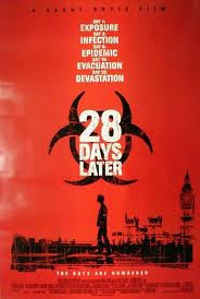
I like the 28 Days Later poster because of its simplicity and artisticness. It has a colour scheme of black and white over a red background - red and black connoting the horror elements like blood and death while the white helps really bring out the information on the poster. It is done to look like it has been done with stencils or graffiti - or as though it was done in a rush/panic. A list of words associated with the zombie apocalypse are listen towards the top of the poster - giving it an official-looking quality and lets the audience know what the film is generally about.


No comments:
Post a Comment